Inspiration meets innovation at Brandweek, the ultimate marketing experience. Join industry luminaries, rising talent and strategic experts in Phoenix, Arizona this September 23–26 to assess challenges, develop solutions and create new pathways for growth. Register early to save.
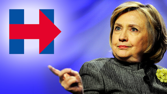
It wouldn't be an election season without a full-on Internet-fueled art-school-esque critique of a candidate's logo. This week's victim: Hillary Clinton!
I'm running for president. Everyday Americans need a champion, and I want to be that champion. –H https://t.co/w8Hoe1pbtC
— Hillary Clinton (@HillaryClinton) April 12, 2015
Along with her campaign announcement on Sunday, Clinton showed off her new logo—a big blue H with a red arrow striking through it, pointing to the right. Of course, the Internet freaked out and issued a torrent of snark-laden reactions to the design.
Critics commented on everything from the direction the arrow is pointing to other logos it reminds them of (cough, FedEx, cough) and of course made some other super-tangential-oddball associations.

WORK SMARTER - LEARN, GROW AND BE INSPIRED.
Subscribe today!
To Read the Full Story Become an Adweek+ Subscriber
Already a member? Sign in

