Inspiration meets innovation at Brandweek, the ultimate marketing experience. Join industry luminaries, rising talent and strategic experts in Phoenix, Arizona this September 23–26 to assess challenges, develop solutions and create new pathways for growth. Register early to save.
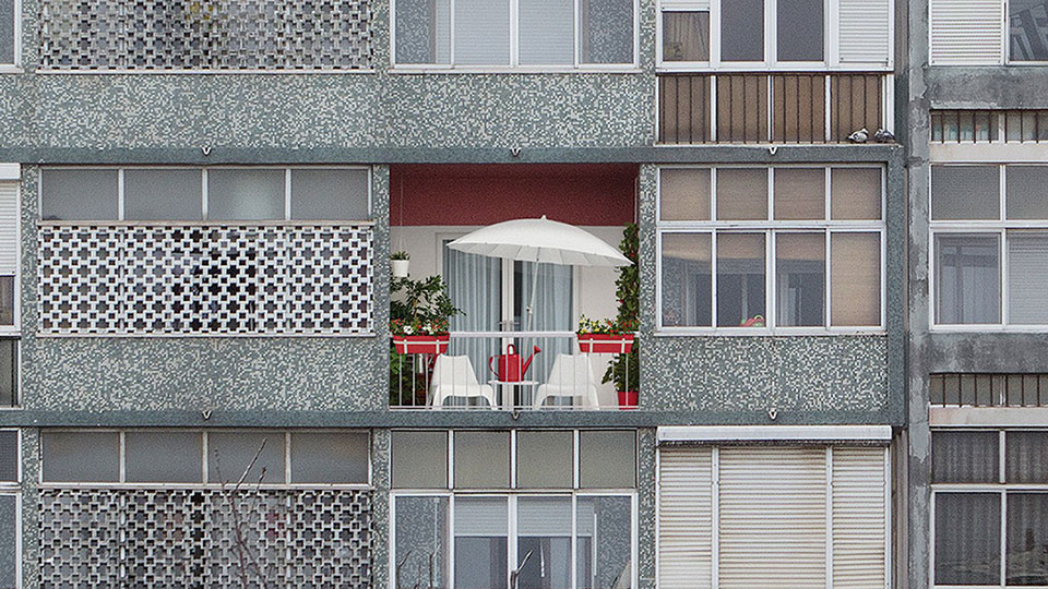
Ikea nicely contrasts its colorful design sense with the drabness of the world at large in these print ads from TBWA in Portugal. Apparently, going with Ikea means you get a balcony in buildings that otherwise don't have any.
The approach recalls Jung von Matt/Elbe's outdoor ads for home-improvement chain OBI. A splash of color in a gray landscape is so good at communicating a freshness of vision.
Full ads below. Via Ads of the World.

WORK SMARTER - LEARN, GROW AND BE INSPIRED.
Subscribe today!
To Read the Full Story Become an Adweek+ Subscriber
Already a member? Sign in

